Dive into the world of acrylics! This guide unlocks vibrant hues, blending techniques, and essential knowledge for artists seeking mastery in color creation.
What is Acrylic Paint?
Acrylic paint is a fast-drying, water-based paint known for its versatility. Unlike oils, it doesn’t require harsh solvents for cleanup – water does the trick! This makes it a popular choice for beginners and professionals alike. The pigment is suspended in an acrylic polymer emulsion, giving it a plastic-like quality when dry.
Acrylics are incredibly adaptable, working well on various surfaces like canvas, paper, wood, and fabric. They can be thinned with water to create watercolor-like effects or used thickly for impasto techniques, mimicking the texture of oil paints. Different acrylic formulations exist, including heavy body, soft body, and acrylic inks, each offering unique properties.
Because of its quick drying time, acrylics are excellent for layering and building up colors rapidly. However, this also means you need to work relatively quickly or use retarders to slow down the drying process. Understanding these characteristics is crucial for successful color mixing.
Why Learn Color Mixing?
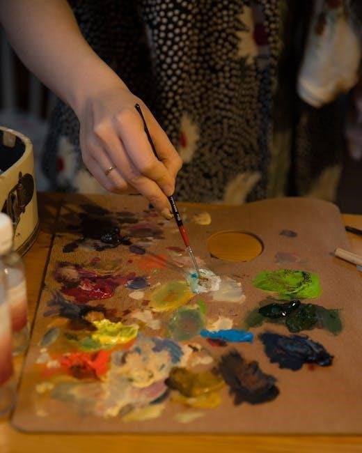
Mastering color mixing unlocks a new level of artistic expression. Relying solely on pre-mixed colors limits your palette and creative potential. Learning to blend your own shades allows you to achieve precise hues, subtle variations, and truly unique color combinations impossible to find in tubes.
Color mixing isn’t just about replicating reality; it’s about conveying mood, emotion, and atmosphere. Understanding how colors interact empowers you to create depth, contrast, and visual interest in your artwork. It fosters a deeper connection with your materials and a greater control over the final outcome.
Furthermore, color mixing is a fundamental skill that enhances observation skills. You’ll begin to analyze colors in the world around you, breaking them down into their component parts and understanding their relationships. This skill translates beyond painting, enriching your overall artistic perception.

Understanding the Color Wheel
The color wheel is your guide! It visually represents color relationships, aiding in harmonious blends and informed decisions for stunning acrylic paintings.
Primary Colors in Acrylics
Foundation of all hues: Primary colors – red, yellow, and blue – are the cornerstone of acrylic painting. These colors cannot be created by mixing other colors together, making them fundamentally essential to your palette. Think of them as the building blocks for every other shade imaginable.
When selecting your primary acrylics, quality matters. Opt for artist-grade paints for richer pigments and better mixing results. Cadmium Red Hue, Hansa Yellow Medium, and Ultramarine Blue are excellent choices for beginners. Experiment with different shades within each primary color category – a warm red versus a cool red, for example – to expand your mixing possibilities.
Understanding the characteristics of each primary color is crucial. Red tends to be a powerful, advancing color, while blue is often perceived as calming and receding. Yellow brings brightness and energy. Mastering these basics will empower you to confidently create a vast spectrum of colors.
Secondary Colors in Acrylics
Mixing the basics: Secondary colors – green, orange, and purple – are born from equal parts of two primary colors. This is where the magic of color mixing truly begins! Orange results from blending red and yellow, green from yellow and blue, and purple from red and blue. Achieving clean, vibrant secondary colors requires careful attention to proportions.
Avoid creating muddy mixtures by thoroughly cleaning your brush between each color. Start with a small amount of each primary color and gradually add more until you reach your desired shade. Note that the specific hues of your primary colors will influence the resulting secondary color. A warmer red will yield a warmer orange, for instance.
Experiment with varying the ratios of primary colors to create different variations within each secondary color family. A touch more blue in your green will create a cooler, more subdued tone.
Tertiary Colors in Acrylics
Expanding the palette: Tertiary colors are created by mixing a primary color with a neighboring secondary color. This results in shades like red-violet, red-orange, yellow-orange, yellow-green, blue-green, and blue-violet. These nuanced hues offer a wider range of expression and are crucial for realistic painting and subtle color variations.
When mixing, always start with the primary color as your base and gradually add the secondary color. Observe how even small adjustments can dramatically alter the resulting shade. For example, adding a tiny amount of violet to red will create a delicate red-violet, while a larger proportion will lean towards a deeper, more purple hue.
Experimenting with different ratios is key to mastering tertiary color mixing. Keep detailed notes of your mixtures to recreate successful shades in the future, building your personal color library.
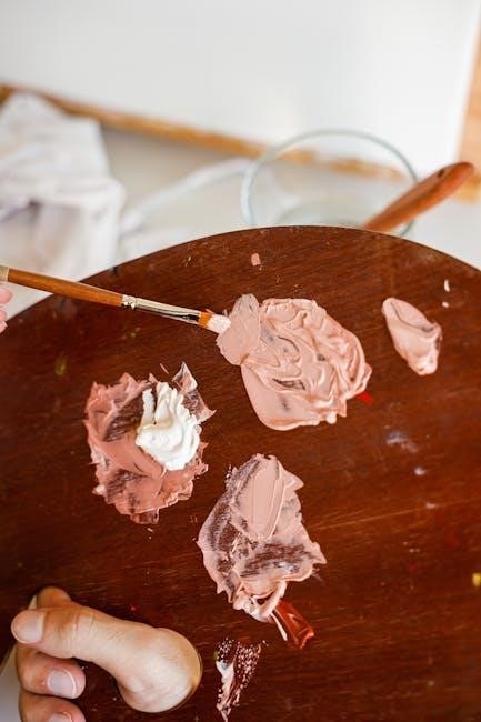
Basic Color Mixing Techniques
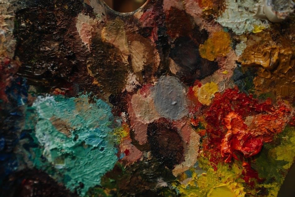
Essential foundations: Learn to manipulate acrylics with white, black, and gray, creating tints, shades, and tones – the building blocks of a versatile palette.
Mixing with White: Tints
Creating Lighter Values – Introducing white to a color produces a tint, lightening its original hue. This is a fundamental technique for achieving a broader range of values within your artwork. Start with a small amount of white and gradually add it to your chosen color, mixing thoroughly after each addition;
Controlling the Tint – The ratio of color to white dictates the lightness of the tint. A small amount of white will create a pastel shade, while a larger proportion will result in a very pale tint. Be mindful of overmixing, as it can dilute the color’s intensity.
Opacity Considerations – White acrylic tends to be opaque. Adding too much white can reduce the vibrancy and transparency of your original color, especially with darker hues. Experiment with different white acrylics – some are more transparent than others – to find one that suits your style. Remember to keep a record of your color mixtures for consistency!
Mixing with Black: Shades
Developing Depth and Drama – Adding black to a color creates a shade, darkening its original hue and adding depth. This technique is crucial for representing shadows, form, and creating a sense of realism in your paintings. However, black can be a powerful color, so use it judiciously.
The Risk of Dullness – Black can quickly overwhelm a color, leading to muddy or dull shades. Begin with a very small amount of black and mix it in gradually, observing the changes in color temperature and value. Avoid adding large quantities of black, especially to brighter colors.
Alternative Darkening Agents – Consider using complementary colors to darken a hue instead of relying solely on black. For example, adding a touch of violet to yellow will create a darker, richer shade than simply adding black. This preserves color vibrancy and avoids muddiness. Careful observation is key!
Mixing with Gray: Tones
Subtle Shifts and Harmonious Blends – Introducing gray to a color creates a tone, reducing its saturation while maintaining some of its original hue. This is ideal for achieving a more muted, sophisticated, or realistic effect, particularly when depicting atmospheric perspective or subtle variations in color. Gray offers a softer alternative to black for darkening.
Creating Your Own Grays – Avoid using pre-mixed gray directly from the tube, as it can often appear lifeless. Instead, mix your own grays by combining complementary colors (red & green, blue & orange, yellow & violet). This results in a more nuanced and vibrant gray that harmonizes better with your palette.
Controlling Saturation – The amount of gray added directly impacts the color’s saturation. Small additions create subtle tones, while larger amounts lead to near-neutral shades. Experiment to find the perfect balance for your artistic vision, remembering less is often more.
Advanced Acrylic Color Mixing
Elevate your artistry! Explore nuanced techniques like realistic skin tones, vibrant landscapes, and captivating blues/purples for masterful acrylic paintings.
Creating Realistic Skin Tones
Achieving believable skin tones with acrylics requires a delicate balance. Forget simply using “flesh” colors directly from the tube! Start with a base of titanium white, and gradually introduce small amounts of yellow ochre and burnt sienna. The ratio is crucial; too much yellow creates a sickly hue, while excessive sienna results in muddiness.
For warmer skin tones, add a touch of cadmium red light. Cooler tones benefit from a hint of ultramarine blue or even a minuscule amount of violet. Remember, skin isn’t a single color; it’s a complex interplay of warmth and coolness.
Layering is key. Build up tones gradually, observing subtle shifts in color across the face. Consider adding a glaze of transparent red or purple to areas with more blood flow, like cheeks and lips. Don’t forget to observe real-life references – photographs or, ideally, live models – to accurately capture the nuances of skin tone.
Mixing Greens for Landscapes
Avoid using green straight from the tube! Natural greens are rarely a single shade. Instead, create depth and realism by mixing your own. A foundational mix involves combining phthalo blue (a cool green base) with cadmium yellow. Varying the proportions yields a wide range of greens – more yellow for brighter, spring-like hues, and more blue for deeper, forest greens.
To neutralize overly bright greens, introduce a touch of burnt sienna or red. This creates more muted, natural tones. For olive greens, add a small amount of yellow ochre. Consider layering different greens to mimic the complexity of foliage.
Observe how light affects green. Add white for highlights and a touch of violet or blue for shadows. Remember, greens aren’t isolated; they interact with surrounding colors, influencing their appearance.
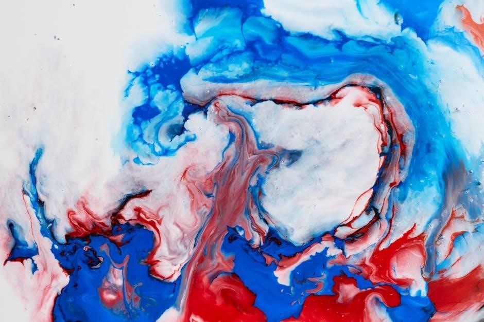
Achieving Vibrant Blues and Purples
Unlock a spectrum of blues and purples! Start with primary colors: phthalo blue (cool) and ultramarine blue (warm). Phthalo blue offers intense, transparent shades, while ultramarine provides a more granular, opaque quality. For vibrant purples, combine red and blue – a crimson red with ultramarine creates deep, regal purples, while a brighter red with phthalo blue yields vivid violet tones.
To avoid dull purples, ensure your red and blue are clean and not muddy. Adding a touch of magenta can boost vibrancy. Lighten blues and purples with white, but be cautious – overdoing it can create pastel shades.
Experiment with layering. Glazing a cooler blue over a warmer purple adds depth. Consider the context; blues shift depending on surrounding colors.
Color Mixing Challenges & Solutions
Overcome common hurdles! Learn to avoid muddy mixtures, understand temperature’s impact, and master techniques for predictable, beautiful results in your acrylic paintings.
Avoiding Muddy Colors
Muddy colors are a frequent frustration for acrylic painters, often resulting from over-mixing or combining too many hues. The key to clarity lies in understanding that each time you mix two colors, you risk diminishing their vibrancy. To prevent muddiness, start with a limited palette – perhaps just three primary colors plus white.
Resist the urge to blend everything together on your palette! Instead, layer colors on your canvas, allowing optical mixing to occur. This means applying thin washes of different colors on top of each other, letting the eye blend them. Clean your brush thoroughly between each color pickup to avoid contamination.
Also, be mindful of complementary colors. While useful for neutralizing, mixing them directly can quickly lead to brown or gray. Use them strategically, in small amounts, to tone down a color rather than create a new one. Finally, remember that a little goes a long way – start with small amounts of each color and gradually add more until you achieve the desired shade;
Color Temperature and its Impact
Understanding color temperature is crucial for creating harmonious and realistic paintings. Colors are generally categorized as warm (reds, oranges, yellows) or cool (blues, greens, purples). Warm colors tend to advance visually, creating a sense of energy and excitement, while cool colors recede, suggesting calmness and distance.
The interplay of warm and cool colors dramatically affects a painting’s mood. Juxtaposing warm and cool tones creates contrast and visual interest. For example, a warm red against a cool blue will appear more vibrant. Consider the light source in your scene – is it a warm sunset or a cool overcast day?
Adjusting color temperature can also create depth. Using cooler colors in the background and warmer colors in the foreground enhances the illusion of space. Be mindful of subtle temperature shifts within a single color; even a slight addition of red or blue can significantly alter its perceived warmth or coolness, impacting the overall composition.
Resources for Further Learning
Expand your skills! Explore online tools, tutorials, and recommended acrylic paint brands to deepen your understanding and refine your color mixing abilities.
Online Color Mixing Tools
Digital assistance is readily available! Several websites offer interactive color mixing simulations, proving invaluable for experimenting without wasting paint. These tools allow you to virtually combine hues, observe the resulting shades, and understand color relationships before applying them to your canvas.
Some platforms provide pre-set palettes and color schemes for inspiration, while others let you create custom mixes based on RGB or hexadecimal values. This is particularly helpful for replicating specific colors or achieving desired effects. Searx instances, like searx.fmhy, can locate these resources efficiently.
Furthermore, many online resources offer color theory tutorials and visual aids, complementing the practical experience gained from using mixing tools. Exploring these digital aids can significantly accelerate your learning process and enhance your artistic capabilities, bridging the gap between theory and practice.
Recommended Acrylic Paint Brands
Quality paints yield superior results! When embarking on your color mixing journey, selecting reputable brands is crucial. Golden Artist Colors are highly regarded for their rich pigments, smooth consistency, and excellent lightfastness, making them ideal for professional artists.
Liquitex is another popular choice, offering a wide range of acrylics at various price points, suitable for both beginners and experienced painters. Their BASICS line provides an affordable entry point without compromising too much on quality.
Winsor & Newton Galeria acrylics are also well-respected, known for their vibrant colors and good coverage. Experimenting with different brands allows you to discover preferences based on texture, pigment load, and overall handling characteristics. Remember to consider student-grade versus artist-grade options based on your budget and skill level.